

The code that accompanies this article can be downloaded here.
Do you have a feeling that wherever you turn someone is talking about artificial intelligence? Terms like machine learning, artificial neural networks and reinforcement learning, became these big buzzwords that you cannot escape from. This hype might be bigger than the one we faced with micro-services and serverless a couple of years ago. When we are talking about these techniques we are usually talking about algorithms and architectures that we will apply to our data. Sometimes we talk about math (linear algebra, probability, calculus, etc.) that can lead us to the solution for our problem.
However, the crucial part of any ML/DL/AI application is, sometimes overlooked, data. You might have heard the term “garbage in – garbage out“, which often used by the more experienced data scientist. This is referring to the situation in which data is not prepared for processing. That is why we utilize different techniques of data analysis and data visualization to clean up the data and remove the “garbage”. In fact, we are applying data analysis and data visualization in every step of building this kind of applications.

For example, when we are working on one machine learning model, the first step is data analysis or exploratory data analysis. In this step, we are trying to figure out the nature of each feature that exists in our data, as well as their distribution and relation with other features. We aim to clean up all the unnecessary information that could potentially confuse our algorithm.
After this step, we run an algorithm and evaluate it. If we are not satisfied with the results we go back to data analysis or apply a different algorithm. The similar path we take if we want to make deep learning model or artificial intelligence application. As you can see, exploratory data analysis is a crucial element of this process. Without it, our smart algorithms would give too optimistic results (overfitting) or plain wrong results.
Data, Features & Major Steps

Before we into details of each step of the analysis, let’s step back and define some terms that we already mentioned. First of all, what is data and in which form we “consume” it? Data are records of information about some object organized into variables or features. A feature represents a certain characteristic of a record. If you are having a software development background, a record is an object and feature is a property of that object.
Data usually comes in tabular form, where each row represent single record or sample and columns represent features. There are two types of features that we explore:
- Categorical Features – These features have discrete values that are mutually exclusive. You can observe them as enumerations.
- Quantitative Features – These features have continuous, numeral values. In general, they represent some sort of measurement.
It is very important to figure out the nature of every feature in the dataset. This is because that data that we get from our clients or from our measurements can be messy. So, which steps can we perform in order to mitigate that chaos and prepare data for processing? When we are talking about exploratory data analysis we are talking about several important steps which are represented in the image below:

In this article, we will not write about the last step – Feature Engineering. This step includes creating new information from existing data and it is a large topic that is out of the scope of this blog post. Before we dive into each step of exploratory data analysis, let’s find out which technologies we use.
Technologies & Modules

At the moment Python is the most popular language for data scientists. This is because of the vast variety of modules that you can use for different data science tasks. In this article, we will use Python 3.7. Apart from that, we use modules:
- Pandas – this is an open source library providing easy-to-use and high-performance data structures and analysis tools for the Python.
- Seaborn – this is data visualization library based on matplotlib library. It provides a high-level API for drawing statistical graphics.
- Matlotlib – this is a Python 2D plotting library. Using it we can create plots, histograms, bar charts, scatterplots, etc.
- MissingNo – this is another data visualization library for Python, that we will use for missing data detection.
- NumPy – this is Python library for scientific computing.
We use Jupyter IDE for the needs of this article. The complete code presented here can be found inside Jupyter Notebook here. Importing aforementioned modules inside of Jupyter Notebook is done like this:
| import pandas as pd | |
| import seaborn as sb | |
| import matplotlib.pyplot as plt | |
| import missingno as ms | |
| import numpy as np |
Bike Sharing Demand Dataset

Bike sharing systems work like somewhat like rent-a-car systems. Basically, there are several locations in a city where one can obtain a membership, rent a bicycle and return it. Users can rent a bicycle in one location and return it to a different location. At the moment, there are more than 500 cities around the world with these systems at the moment.
The cool thing about these systems, apart from being good for the environment, is that they record information about a number of rented bikes. When this data is combined with weather data, we can use it for investigating many topics, like pollution and traffic mobility. That is exactly what we have on our hands in Bike Sharing Demands Dataset. This dataset is provided by the Capital Bikeshare program from Washington, D.C.
This dataset has two files, one for the hourly (hour.csv) records and the other for daily (day.csv) records. This data is collected between 2011. and 2012. and it contains corresponding weather and seasonal information. In this article, we will use only hourly samples. Here is how that looks:

The hour_train.csv file contains following features (attributes):
- Instant – sample index
- Dteday – Date when the sample was recorded
- Season – Season in which sample was recorded
- Spring – 1
- Summer – 2
- Fall – 3
- Winter – 4
- Yr – Year in which sample was recorded
- The year 2011 – 0
- The year 2012 – 1
- Mnth – Month in which sample was recorded
- Hr – Hour in which sample was recorded
- Holiday – Weather day is a holiday or not (extracted from [Web Link])
- Weekday – Day of the week
- Workingday – If the day is neither weekend nor holiday is 1, otherwise is 0.
- Weathersit – Kind of weather that was that day when the sample was recorded
- Clear, Few clouds, Partly cloudy, Partly cloudy – 1
- Mist + Cloudy, Mist + Broken clouds, Mist + Few clouds, Mist – 2
- Light Snow, Light Rain + Thunderstorm + Scattered clouds, Light Rain + Scattered clouds – 3
- Heavy Rain + Ice Pallets + Thunderstorm + Mist, Snow + Fog – 4
- Temp – Normalized temperature in Celsius.
- Atemp – Normalized feeling temperature in Celsius.
- Hum – Normalized humidity.
- Windspeed – Normalized wind speed.
- Casual – Count of casual users
- Registered – Count of registered users
- Cnt – Count of total rental bikes including both casual and registered
Loading this data into Python variable is done using Pandas and function read_csv. The only parameter is file location:
| data = pd.read_csv('hour_train.csv') |
Univariate Analysis

In this first step of data analysis, we are trying to determine the nature of each feature. Sometimes categorical variables can have the wrong type. Or some quantitative data is out of scale. These things are investigated during univariate analysis. We observe each feature individually, but we try to grasp the image of the dataset as a whole. A good approach is to get the shape of the dataset and observe the number of samples. We can also print several samples and try to get some information from them. Again, we are using Pandas for this:
| print(data.shape) | |
| data.head() |
Pandas function head will give us first five records from the loaded data. We can show more data by giving any number as a parameter. Here is the output of the code snippet from above:

From this output, we can see that we are having 13949 samples or records. Apart from that, we can notice that features have values on different scales. For example, record 0 has temp feature has value 0.24 while feature registered has value 13. If we are working on some machine learning or deep learning solution, this is a situation we need to address and put these features into the same scale. If we don’t do that before we start the training process, the machine learning model will “think” that registered feature is more important than temp feature. In this article, we will not do that, because it is out of the scope, but we can suggest some tools that could help you with this, like StandardScaler from SciKitLearn library.
Another thing we can notice is that some features are not carrying information and are useless. Like features instant (just an index of the sample) and dteday (contained in other features). So we can remove them:
| drop_features = {"instant", "dteday"} | |
| data = data.drop(columns=drop_features) | |
| data.head() |
The next thing we can do in this analysis is checking the datatypes of each feature. Again, we use Pandas for this:
| data.dtypes |
The output of this call looks like this:

The important thing to notice here is that we have categorical variables like season, year (yr), month (mnth), etc. However, these features in the loaded data have type int64, meaning machine learning and deep learning models will observe them as quantitative features. We have to change this and change their type. We can do that like this:
| categorical_features = {"season", "yr", "mnth", "holiday", "hr", "workingday", "weekday", "weathersit"} | |
| for feature in categorical_features: | |
| data |
|
| data.dtypes |
Now, when we call data.dtypes we get this output:

Great, now our categorical features are really having type category.
Missing Data

Data can come in an unstructured manner. Meaning some records may miss data for some features. We need to detect those places and replace them with some values. Depending on the rest of the dataset, we may apply different strategies for replacing those missing values. For example, we may fill these empty slots with average feature value, or maximal feature value. For detecting missing data, we use Pandas or Missingno:
| print(data.isnull().sum()) | |
| ms.matrix(data,figsize=(10,3), color = (0.1, 0.4, 0.1)) |
The output of these two lines of code looks like this:

The first, tabular section comes from Pandas. Here we can see that there is no missing values inside this dataset (all zeros). In the second section, which is more graphical and comes from Missingno, we get the confirmation for this. If there were missing values, Missingno output would have horizontal white lines, indicating that is the case.
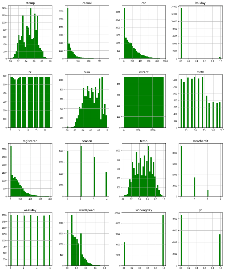
Distribution

The important characteristic of features we need to explore is distribution. This is especially important for this example since our output (dependent variable Count) has a quantitative nature. Mathematically speaking the distribution of a feature is a listing or function showing all the possible values (or intervals) of the data and their frequency of occurrence. When we are talking about the distribution of categorical data, we can see see the number of samples in each category. On the other hand, when we are observing a distribution of numerical data, values are ordered from smallest to largest and sliced into reasonably sized groups.
Distribution of the data is usually represented with a histogram. Basically, we split complete the range of possible values into intervals and count how many samples fall into each interval. To do this in Python we use Seaborn module:
| plt.figure(figsize=(20, 8)) | |
| sb.distplot(data['cnt'], color='g', bins=30, hist_kws={'alpha': 0.4}); |
In this particular case, we are using Count feature, i.e. of the output, with created interval of 30 samples. Here is how that histogram looks like:

Apart from this, we can do this for every feature in the dataset:
When we are observing the distribution of the data, we want to describe certain characteristics like it’s center, shape, spread, amount of variability, etc. To do so we use several measures.
Measures of Center
For describing the center of the distribution we use:
- Mean – This value is the average of a set of samples. Meaning, it represents the sum of the values of the feature for each sample divided by the number of samples.
- Mode – The mode is identified as a “peak” of the histogram. Distributions can have one mode (unimodal distributions) or two modes (bimodal distributions).
- Median – This value represents the midpoint of the distribution. It is the number such that half of the observations fall above, and half fall below.
To get these values we can use Pandas functions mean, mode and median:

We can call them on the complete dataset as well and get these values for all features:

Measures of Spread
To describe the spread we most commonly use measures:
- Range – This measure represents the distance between the smallest data point and the largest one.
- Inter-quartile range (IQR) – While range covers the whole data, IQR indicates where middle 50 percent of data is located. When we are looking for this value we first look for the median M, since it splits data into half. Then we are locating the median of the lower end of the data (denoted as Q1) and the median of the higher end of the data (denoted as Q3). Data between Q1 and Q3 is the IQR.
- Standard deviation – This measure gives the average distance between data points and the mean. Essentially, it quantifies the spread of a distribution.
To get all these measures we use describe the function of Pandas. This function will give back the rest of the measures that we used for the center as well. Here is how that looks like.

Similar to the previous functions we can call it over whole dataset and get these statistics for every feature:

Outliers

Outliers are values that are deviating from the whole distribution of the data. They can be natural, provided by the same process as the rest of the data, but sometimes they can be just plain mistakes. Thus sometimes we want to have these values in the dataset, since they may carry some important information, while other times we want to remove those samples, because of the wrong information that they may carry. In a nutshell, we can use the IQR to detect outliers. We can define outliers as samples that fall below Q1 – 1.5(IQR) or above Q3 + 1.5(IQR). However, the easiest way to detect those values is by using boxplot.
The purpose of the boxplot is to visualize the distribution, but in a different way than histogram does. In essence, it includes important points that we explained in the previous chapter: max value, min value, median, and two IQR points (Q1, Q3). Here is how one example of boxplot looks like:

Note that max value can be an outlier. This is how we can see all the important points using boxplot and detect outliers. By the number of these outliers we can assume their nature, i.e. are they mistakes or a natural part of the distribution.
In Python, we can use Seaborn library to get the boxplot for single a feature, or for the combination of two features. This is technique is useful for exploring the relationship between quantitive and categorical variables. In this concrete example, we displayed not only distribution of the Count feature on its own, but its relationship with several features as well. Here is the code snippet:
| fig, axes = plt.subplots(nrows=5,ncols=1) | |
| fig.set_size_inches(10, 30) | |
| sb.boxplot(data=data,y="cnt",orient="v",ax=axes[0], palette="Greens") | |
| sb.boxplot(data=data,y="cnt",x="season",orient="v",ax=axes[1], palette="Greens") | |
| sb.boxplot(data=data,y="cnt",x="hr",orient="v",ax=axes[2], palette="Greens") | |
| sb.boxplot(data=data,y="cnt",x="yr",orient="v",ax=axes[3], palette="Greens") | |
| sb.boxplot(data=data,y="cnt",x="workingday",orient="v",ax=axes[4], palette="Greens") |
And the images:

In this particular case, without going into detail analysis, we may assume that these outliers are part of the natural process and that we will not remove them.
Correlation Analysis

So far we observed features individually and the relationship between quantitative and categorical features. However, in order to prepare data for our fancy algorithms, it is always important to analyze relationships of one quantitative feature to another. The goal of this section of the analysis is to detect features that are affecting output too much, or features that are carrying the same information. In general, this is usually happening when explored features are having a linear relationship. Meaning, we can model this relationship in the form y = kx +n, where y and x are explored features (variables), while k and n are scalar values.

As you can see in the image above, there are two types of a linear relationship, positive and negative. Positive linear relationship means that an increase in one of the feature results in an increase in the other feature. On the other hand, a negative linear relationship means that an increase in one of the feature results in a decrease in the other feature. Another characteristic is the strength of this relationship. Basically, if data points are far away from the modeled function, the relationship is weaker. From the image above we can determine that relationship in the first graph is stronger than on the other one (but it is not that obvious).
In order to determine what kind of relationship we have, we are using visualization tools like Scatterplot and Correlation Matrix. A scatterplot is a useful tool when it comes to displaying features relationship. Basically, we set one feature on X-axis, and the other on the Y-axis. Then for every sample, we pick a point in the coordinate system that has values for respective features. Let’s try it out on Count and Registered features from our dataset. Here are the first 5 samples for these features:

This is how this looks like in Scatterplot:

Now, to create this visualization for two features we use scatterplot function from the Seaborn module. However, there is a function which is called pairplot from the same library that we can use to plot relationships of all quantitive features. Here is how that looks like:

We can not several features that are having a linear relationship. It is apparent that features Count and Registered have a linear relationship, as well as the features Temperature (temp) and Normalized Temperature (atemp). However, from the Scatterplot, we cannot really determine what is the strength of that relationship. For this purpose, we are using the correlation matrix.
Correlation matrix consists of correlation coefficients for each feature relationship. The correlation coefficient is a measure that gives us information about the strength and direction of a linear relationship between two quantitative features. This coefficient can have value from the range -1 tо 1. If this coefficient is negative, examined linear relationship is negative, otherwise, it is positive. If the value is closer to the -1 or 1, the relationship is stronger. To get this information we use a combination of Pandas and Seaborn modules. Here is how:
| corrMatt = data.corr() | |
| mask = np.array(corrMatt) | |
| mask[np.tril_indices_from(mask)] = False | |
| fig,ax= plt.subplots() | |
| fig.set_size_inches(20,10) | |
| sb.heatmap(corrMatt, cmap="Greens", mask=mask,vmax=.8, square=True,annot=True) |
The output of this code snippet, looks like this:

As you can see, this confirms our initial analysis with Scatterplot. Meaning, Coung and Registered, as well as Temperature and Normalized Temperature, have a strong positive linear relationship. In order to get better results with our artificial intelligence solutions, we may choose to remove some of those features.
Conclusion
In this article, we tried to cover a lot of ground. We went through several statistical methods for analyzing data and detecting potential downfalls for your AI applications. What do you think? What are your favorite Exploratory Data Analysis techniques?
Read more posts from the author at Rubik’s Code.


Going through the process is helpful but what is the point of demonstrating this process on a clean dataset? It would be more helpful to see a messy dataset and how you would address each of the issue discovered with the dataset.
Hi Kevin,
Thank you for reading the article, and for your feedback.
I used this dataset because I am familliar with it and I think that learning these steps is easier on clean dataset. However, your suggestion is a good idea and I will do so in the second itteration of the article with the messy dataset.
Cheers,
Nikola